
Fewer clicks in a component used all day long
- Session analysis (Hotjar)
- Benchmark
- Hypothesis
- Handoff
- Controlled rollout
- −48%clicks per selection
- 11 s → 5 sto complete the selection
- 37%faster on the first interaction
- GradualTargeted validation, then across the whole platform
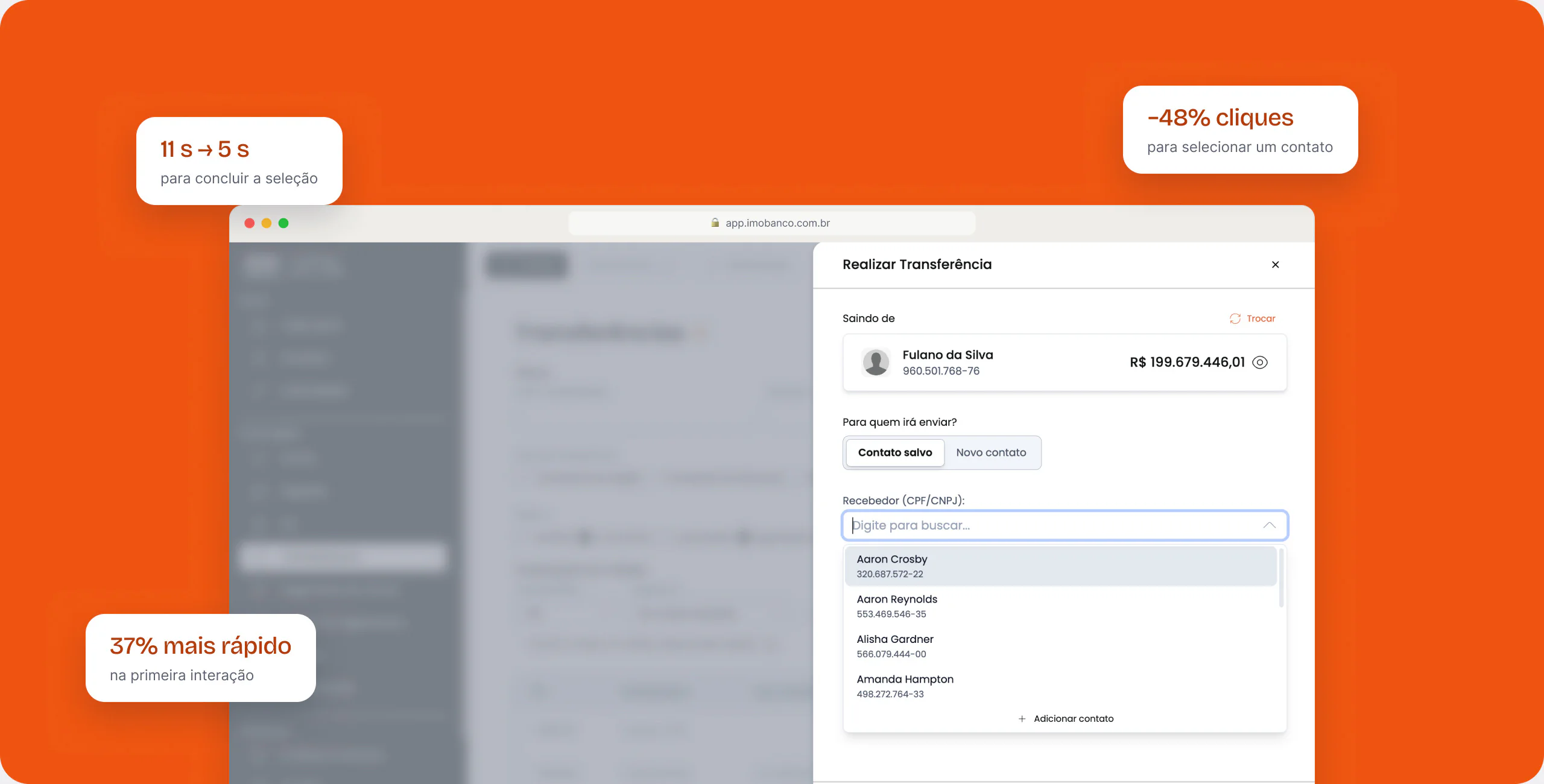
Imobanco is used by entrepreneurs who, at certain times of the month, make dozens of transactions in a row. The contact and wallet selector, present in almost all of them, required up to 6 clicks, scrolling in two directions and had duplicate search fields.
The problem was silent. No one on the team analyzed usage behavior, so these frictions only surfaced at critical moments, when someone called support. Before proposing the solution, I had to show the need existed.
- 01 · InvisibleThe friction only reached the team when it became a support ticket.
- 02 · EvidenceReal sessions on Hotjar (11 to 20 s per selection, up to 30 min to learn) and a benchmark of market patterns.
- 03 · PriorityWith the data, the team accepted the need and the controlled rollout.
In a financial product, every friction in a critical flow becomes a risk of errors, support tickets and churn. Replacing the component across the whole platform at once would be faster, but risky, so I proposed launching in one feature first, measuring, and only then scaling.
All at once
It offered
- Immediate consistency across the whole platform.
Why it didn't fit
- A mistake in a critical financial flow would affect every user at the same time.
One feature first
What we gained
- Real evidence before scaling.
- Risk contained to a single flow.
- Data for the team to decide to invest in scaling.
What we gave up
- For a while, the platform lived with two selector patterns.
We replaced the modal with a searchable dropdown: field, search and selection in the same place. The task dropped from 6 to 2 clicks and from 11 to 5 seconds.
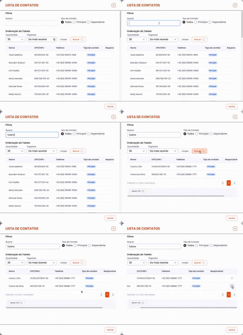

- Início
- Field
- Search
- Find
- Scroll down
- Scroll sideways
- Select
- Fim
- Início
- Field
- Search
- Select
- Fim
- −4 clicks · −6 s per selection
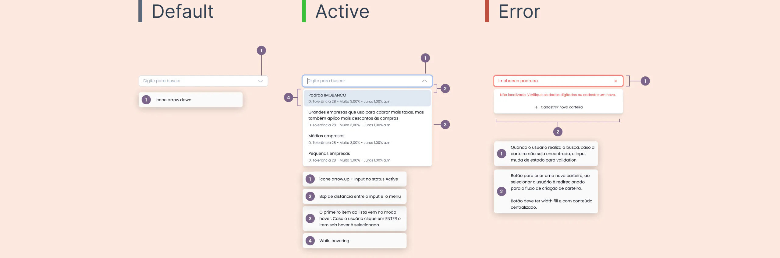
Decisions
Every decision came from data
DecisionA searchable dropdown instead of the modalWhy?
DecisionA single search fieldWhy?
DecisionLaunch in one feature before scalingWhy?
DecisionHandoff with states, rules and tokensWhy?
Where we are
- DoneDiagnosis on Hotjar
- DoneHypothesis and benchmark
- DoneLaunch in one feature
- DoneValidation with users
- DoneScaling to the whole platform
Learnings
- Watching real sessions showed the problem more precisely than any opinion: the user's job was to make several transfers in a row, without friction.
- Involving engineering from the start and documenting every state ensured the pattern scaled the same way across the whole platform.